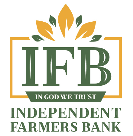
INDEPENDENT FARMERS BANK REBRAND
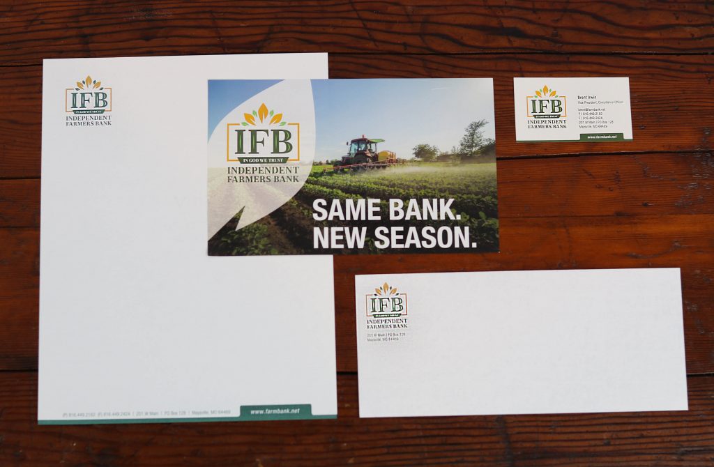
As a thriving bank in the rural heartland, Independent Farmers Bank needed branding that would pay homage to its rural foundations, but indicate it is every bit a growing, modern, relevant institution in today’s banking industry. The serif, inline fonts give the emblem a traditional foundation while the budding leaves and spring-like colors above the shortened moniker (IFB) communicate that Independent Farmers Bank is a growing and flourishing institution. Using “IFB” makes the name easy to recognize and easy to remember.