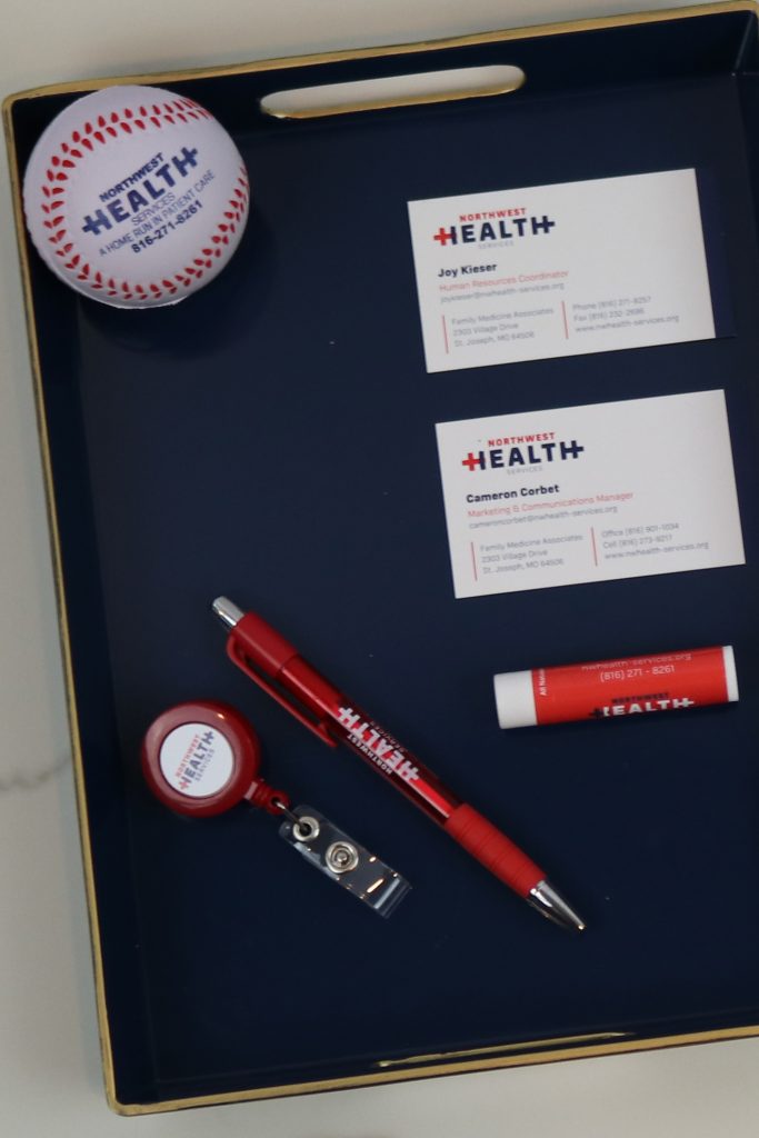
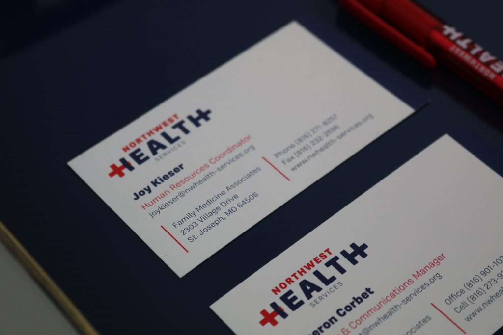
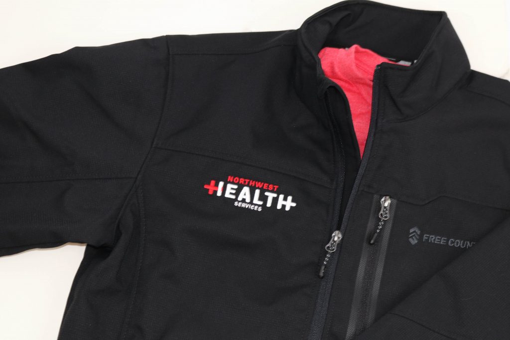
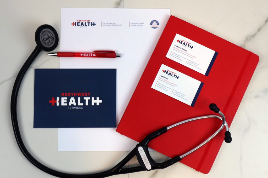
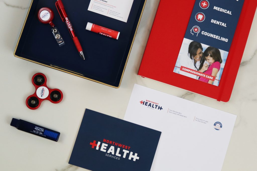
NORTHWEST HEALTH SERVICES
Northwest Health Services needed a rebrand to establish a recognizable presence as a compassionate, quality healthcare provider serving the underserved. We intertwined the medical cross symbol and the letter “H” to communicate that this is a community-oriented organization that reaches out and serves with care. Healthcare is easily inferred and compassion is creatively implied. When one letter can say so much, this branding provides Northwest Health Services a meaningful and memorable voice in their community.