SHAPE BRAND
In order to keep 20,000 employees around the globe informed and inspired, Boehringer Ingelheim incorporated the “SHAPE” brand. This internal branding strategy is intended to enable all of their staff to grow and change together while achieving unity and company-wide success. The design elements of the letter “A” in the very middle of the word “SHAPE” are carefully woven together to serve the branding goals. Morphing the “A” into the universal symbol for change, the “delta” shape establishes a positive approach to constant change. The “swish” underneath the curved lines of the delta indicate this company is on the move, and the various colors blended together convey that many individuals must come together for all to succeed.
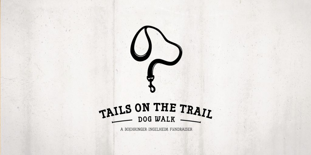
TAILS ON THE TRAIL
Tails on the Trail was a fundraiser sponsored by Boehringer Ingelheim to raise money for the local animal shelter. This event required a clever logo that would encapsulate the spirit of both the event and the company. In creating the logo, we combined the shape of a dog’s head with a leash and added dimension to the shape in order to imply a trail. The modern, whimsical twist to the traditional serif font added a timeless style that fit both the corporate sponsor and the fun-loving dog owner. This cute logo is both smart and fun, much like the company promoting the event.
START: SYSTEMS, TOOLS AND REPORTING TRAINING
What if training at work could be fun? More like a game, a scavenger hunt, or a road trip? That was the concept behind Boehringer Ingelheim’s training program called “START.” With a navigation symbol anchoring the acronym START, we turned this training program into a clever, engaging process from start to finish. Instead of looking at a black and white table of contents, employees got this interactive game board where everyone wins. Colorful and inviting, this makes training more fun and much more memorable!